
Testing two flyer designs. Which one wins?
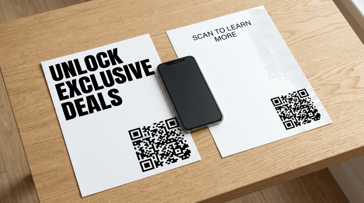
You have two flyer designs sitting in front of you. One feels bolder. One feels cleaner. Your designer prefers version A, your gut says version B, and the print run is due Friday. Picking by taste is a coin flip dressed up as a decision. Flyer A/B testing replaces that argument with a number: put both designs in front of real people, give each its own trackable QR code, and let scans and conversions settle it. This article walks through how to run that test end to end, how to size it so the result means something, and how to read the outcome without fooling yourself into a false winner.
Why Guessing Between Two Flyer Designs Fails
At the bottom of the funnel, the flyer is not a branding exercise. It is asking someone to act: scan, claim, book, or buy. Two designs can look equally good on screen and perform very differently on a lamppost or a counter. The only way to know which one moves people is to measure the behavior, not the opinion.
The trap most SMB owners fall into is treating a preference as evidence. A cleaner layout might win a room of colleagues and lose to a louder one in a busy cafe where people glance for half a second. Design thinking frames the fix directly: its final stage is test and evaluate, and the whole framework stays centered on the end user rather than the designer's instinct, according to Search Engine Land. Your job is not to declare a winner in the meeting. It is to build a small experiment that lets the audience declare one for you.
That is what makes this a bottom-of-funnel decision worth measuring. You are close to spending real money on a real print run. A cheap test now protects the larger spend later.
Set Up the Test: One Unique QR Code Per Design
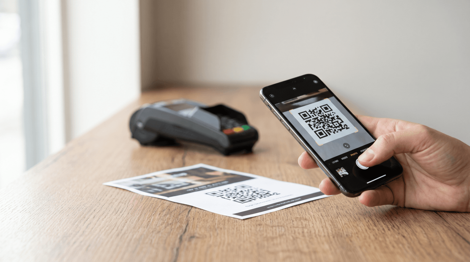
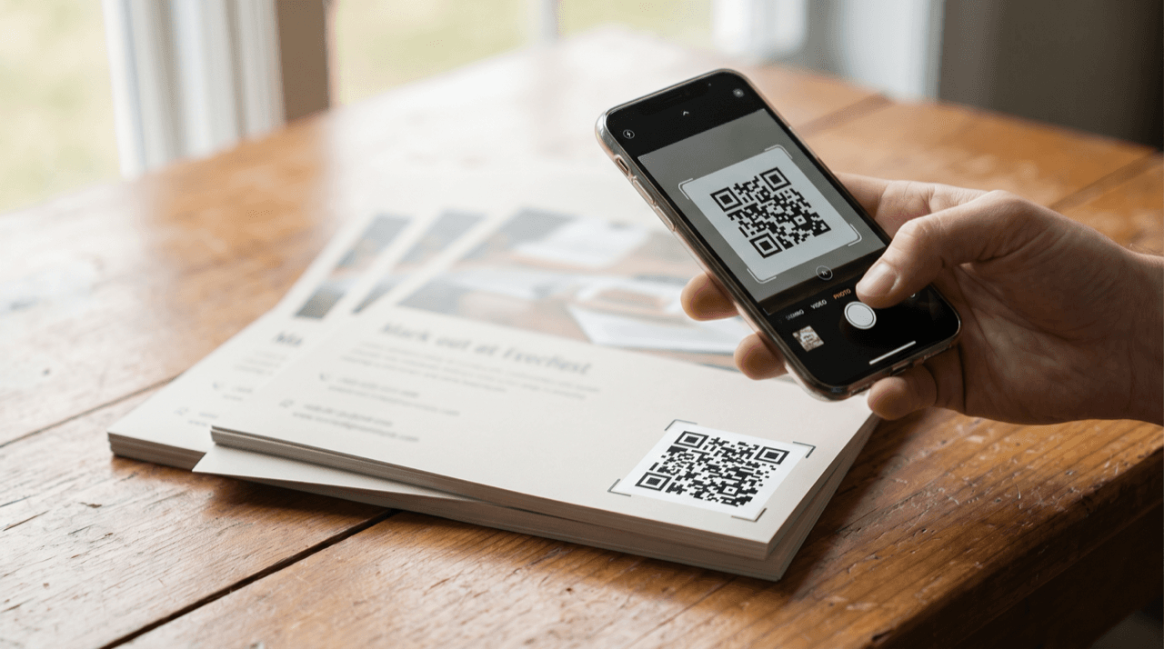
The mechanics are simple. Design A gets its own QR code. Design B gets a different one. Both codes can point to the same landing page, but because each code is distinct, every scan is attributed to the exact flyer it came from. Without that separation you get a pile of scans and no idea which design earned them.
Use dynamic QR codes here, not static ones. A dynamic QR code stores a short redirect URL, so you can change the destination after printing and, more importantly, you get scan tracking on each code: how many scans, when, from what device and location on paid tiers. A static QR code carries a fixed URL and gives you no measurement layer at all. For an A/B test, the measurement layer is the entire point.
Distribute the two designs so nothing except the design differs. Same locations, same days, same times, same quantity printed. If flyer A only goes up on weekends near a train station and flyer B only goes on quiet Tuesday counters, you are testing placement and timing, not design. Hold everything constant except the one thing you want to learn about.
- Shared destination, two codes: cleanest read on design alone, since the landing page is identical.
- Two codes, two tailored pages: useful if the designs promise different offers, but now you are testing two variables at once.
- One code across both designs: never do this for an A/B test; you lose all attribution the moment you print.
Define Your Success Metric Before You Print
Decide what winning means before a single flyer goes up. This is not a formality. The Kirkpatrick evaluation model, the oldest and most widely used framework for measuring results, insists on clearly defined and measurable goals set before the evaluation begins, according to EPALE. Skip that step and you will end up rationalizing whichever number looks better after the fact.
For a flyer, two metrics matter and they are not the same. Scan rate tells you how many people were drawn in enough to raise their phone. Scan-to-conversion rate tells you how many of those scanners actually did the thing you wanted: redeemed the offer, submitted the form, completed the purchase. A design can win on scans and lose on conversions if its promise oversells what the landing page delivers.
Pick your primary metric up front. If the flyer's whole job is to fill a form, conversions are your judge and scans are a supporting signal. Write the target down in plain terms: 'Design wins if it produces a higher scan-to-submission rate over 14 days.' A specific, pre-committed definition is what separates a test from a story you tell yourself later.
What to Actually Vary in Flyer A/B Testing
The discipline of flyer A/B testing is changing one meaningful thing at a time. If design A differs from design B in headline, color, image, and layout all at once, a win tells you nothing about which change caused it. Isolate a single variable so the result is readable.
Good variables to test one at a time include the headline wording, the primary color and its contrast against the background, the size and position of the QR code, and the clarity of the value exchange (what the scanner gets). Readability itself is a high-leverage variable that many marketers overlook. Cognitive accessibility, defined under ISO 21801-1:2020 as the extent to which something can be used by people across the widest range of needs and abilities, is the reason easy-to-read language and clean structure lift response, according to the EU Accessible EU Centre. A flyer a tired commuter can parse in one glance will usually beat a cleverer one they have to decode.
If you genuinely need to test two very different concepts rather than one variable, that is a valid test, but be honest about what it measures. You will learn which whole concept wins, not why. That is fine for a concept screen; it is not a controlled read on any single element.
How Big Does the Test Need to Be?
A result from twelve scans is not a result. It is noise wearing a costume. ESGAB, the European advisory body on statistics, warns that data which looks fact-based can spread fast and mislead people who never check its quality, according to Eurostat. The same caution applies to your own dashboard. A tiny sample can hand you a confident-looking winner that reverses completely the next week.
You do not need a statistics degree, but you do need enough volume to trust the gap between the two designs. As a working rule, treat any difference built on only a handful of conversions as unproven, and keep the test running until each design has accumulated a meaningful count of the action you actually care about, not just raw scans. The rarer the action, the more traffic you need to see it clearly.
Two practical habits keep you honest. First, set the end date and minimum sample before you start, so you are not tempted to stop the moment your favorite pulls ahead. Second, remember that a 10 percent difference on small numbers can vanish on larger ones. If the two designs finish within a whisker of each other, the honest conclusion is that design was not the deciding factor here, and you should say so rather than crown a winner.
A Hypothetical Worked Example You Can Copy
Here is an illustration with round, made-up numbers to show the arithmetic. Treat these as teaching figures, not observed results. Say you print 1,000 copies of design A and 1,000 copies of design B and distribute them identically over two weeks. Design A earns 60 scans; design B earns 40 scans. That is a 6 percent scan rate for A and a 4 percent scan rate for B. On scans alone, A looks like the winner.
Now follow the money. Of A's 60 scanners, 6 complete the form: a 10 percent scan-to-conversion rate, and 6 leads total. Of B's 40 scanners, 8 complete the form: a 20 percent scan-to-conversion rate, and 8 leads total. Design B pulled fewer people in but converted them at twice the rate and produced more actual leads. If leads were your pre-committed primary metric, B wins despite losing on scans.
The lesson from this hypothetical is not the specific numbers; it is the structure. Compute both rates for both designs, then judge against the metric you chose in advance. Do the math yourself with your own counts. A design that wins attention and loses conversion is often a promise the landing page cannot keep.
Reading the Result Without Fooling Yourself
Once the test closes, resist the urge to narrate the outcome you wanted. A trustworthy read stands up to scrutiny, draws on reliable data, and offers a clear 'so what' and 'now what,' which is exactly how Caroline Florence's data storytelling framework defines a story worth acting on, according to Search Engine Journal. Apply that bar to your own two numbers before you announce anything.
Ask three questions. Did the winning design beat the other on the primary metric you set in advance, not a metric you switched to afterward? Was the sample large enough that the gap is unlikely to be luck? Was everything except the design truly held constant across both flyers? If you can answer yes to all three, you have a decision. If you cannot, you have a hypothesis for the next round.
When there is a clear winner, act on it fully: print the winning design at scale, retire the loser, and keep the losing code archived so you can compare future tests against it. When there is no clear winner, that is still a finding. It tells you design was not your bottleneck, and your next test should probably vary placement, offer, or timing instead.
Common Mistakes That Wreck the Test
The fastest way to ruin a flyer A/B test is to change more than one thing and then claim you learned something specific. The second fastest is stopping early. Both produce a number that feels like proof and is not.
Watch for uneven distribution, where one design quietly gets the better spots or the busier days. Watch for judging on scans when your business runs on conversions. Watch for reading a five-scan lead as destiny. And watch for the reverse mistake of running the test forever: once each design has a solid sample and a stable gap, extending it just burns flyers.
One more discipline: keep the two landing experiences identical when you are testing the flyer, and keep the flyers identical when you are testing the landing page. Mixing the two means a win could come from either end, and you will never know which.
Stop arguing about which flyer looks better and let the scans decide. This week: take your two designs, generate a separate dynamic QR code for each, and write down your winning metric in one sentence before you print anything (for example, 'higher scan-to-submission rate over 14 days'). Print equal quantities, distribute them under identical conditions, and set a fixed end date with a minimum sample so you cannot stop the moment your favorite edges ahead. When the window closes, compute scan rate and scan-to-conversion rate for both, judge against the metric you committed to, and only crown a winner if the gap is real. If the two finish neck and neck, that is a result too: design was not your lever, so test placement or offer next.
Start measuring your own campaigns
QRlytics tracks every scan with location, device, and browser data, so you can see which printed pieces actually pay off. The free plan covers your first codes at no cost, and Pro unlocks unlimited dynamic codes and full scan history when you are ready to scale. See all options on the plans page.

Ready to track your QR codes?
Create trackable QR codes with powerful analytics. See who scans, when, and where. All in real-time. Get started for free today.