QR Codes in Museums: 7 Ways to Enhance Visitor Experience
The Silent Failure Hiding in Your Exhibition
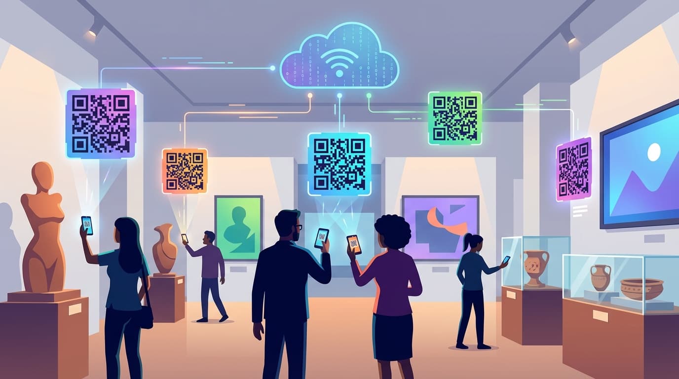
Picture this: A museum curator walks you through their newly redesigned exhibition. Every artifact has a crisp QR code beside it, printed on elegant cards that match the gallery's aesthetic. The team spent months building mobile-friendly pages for each piece. Three months later, they pull up the analytics.
The scan rate is dismal. The vast majority of visitors walked right past every single code.
The curator's first instinct is to blame visitor apathy. "People just don't engage with technology in museums," they say. But that diagnosis is wrong. It leads to worse decisions.
The real problem is a fundamental misunderstanding of how people move through physical spaces. Museums treat QR codes as digital labels: static, passive, positioned exactly where traditional text would go. But a QR code isn't a label. It's a trigger. And triggers only work when they fire at the right moment, in the right context, with the right promise.
The gap between museums that get minimal scan rates and those that see genuine engagement isn't budget, technology, or visitor demographics. It's whether the institution understands that deploying QR codes is a design problem, not a technology problem. You're designing for human curiosity in a physical environment where attention is scarce, feet are tired, and phones are competing with centuries-old masterpieces.
Visitors Don't Read Labels. They Hunt for Stories
The biggest mistake museums make is placing QR codes where traditional labels go and expecting different results. If visitors already skip your wall text, why would they pull out a phone to access more of the same thing?
Research in gallery settings shows that visitors spend very limited time at most artifacts. That's not a reading window. That's a glance. And in that glance, a QR code positioned as "more information" is competing directly with the artifact itself for attention.
The artifact wins every time. As it should.
Museums that crack this problem stop thinking about QR codes as information delivery and start thinking about them as story unlocks. An information delivery says: "Scan to learn more about this 14th-century chalice." A story unlock says: "This chalice was hidden in a wall for 200 years. Scan to find out why."
This is the curiosity gap principle at work. QR codes perform dramatically better when they promise to answer a question the visitor already has, or when they plant a question the visitor didn't know they wanted answered. Generic "learn more" prompts fail because they don't create tension.
The "Mystery Point" Approach
Some institutions have experimented with moving QR codes away from individual artifacts entirely, placing them at "mystery points" within exhibitions. These locations let the code connect to a broader narrative thread rather than a single object. The thinking is counterintuitive: separate the code from the thing it describes.
But it works because it transforms scanning from a passive reference action into an active discovery moment. When a visitor scans a QR code next to a painting, they're looking up information. When they scan a code at a "mystery point" that connects three different artifacts in the room through an unexpected story, they're exploring. The psychological difference is enormous, and it shows in engagement metrics.
The Three-Second Decision: What Makes Visitors Actually Scan
Every QR scan in a museum involves a rapid chain of micro-decisions, and each one is a potential dropout point. Is this worth stopping for? Is it worth pulling out my phone? Worth unlocking the screen? Worth opening the camera? Worth waiting for it to focus? Worth waiting for the page to load?
That's multiple decision points in just a few seconds. Each one carries friction, and friction is the silent killer of scan rates.
Run a friction audit on your exhibition. Walk through it as a visitor would. Time every step from "I notice the QR code" to "I'm consuming the content." If that journey takes too long, you're losing potential scanners. Every extra second of load time, every unnecessary redirect, every cookie consent popup is a visitor who puts their phone away and moves on.
Size, Contrast, and the Paradox of Prominence
Common advice says to make QR codes bigger and more prominent. That's incomplete to the point of being misleading. A massive QR code on a gallery wall can feel intrusive, institutional, desperate. It signals "we really want you to scan this," which paradoxically makes visitors less interested.
Context and contrast matter more than raw size. A QR code needs to be large enough to scan comfortably from the distance at which a visitor would naturally stand. But beyond functional scannability, bigger isn't better.
The preview text beside the code (that single compelling sentence selling the scan) does more work than the code's size ever will. "Hear this painting described by the artist's granddaughter" outperforms a QR code twice its size that just says "More info."
The WiFi Factor Nobody Mentions
Here's a practical reality that gets overlooked: if your building doesn't have reliable, free WiFi, your scan rates will suffer dramatically. Visitors on mobile data face slower load times, potential roaming charges for international tourists, and dead spots in thick-walled historic buildings.
WiFi availability isn't a nice-to-have. It's infrastructure that directly determines whether your QR strategy succeeds or fails.
One more thing: visitors scan more when they see others scanning. Social proof operates powerfully in gallery spaces. If your early visitors aren't scanning, your later visitors won't either. This creates a flywheel effect (positive or negative) that makes launch execution critical.
Why Your QR Content Fails After the Scan
Winning the scan is only half the battle. Most museums lose the engagement immediately after because they deliver content designed for someone sitting at a desk, not someone standing in a gallery holding a phone in one hand and a museum map in the other.
A visitor in a gallery will not read lengthy text on a phone screen. They won't pinch-zoom a PDF. They won't scroll through an academic essay about provenance. They are standing, probably in someone's way, with ambient noise, shifting light on their screen, and a room full of other things competing for their attention.
Mobile-first design isn't enough. You need distracted-visitor-first design.
Content Formats Ranked by What Actually Works
Based on how visitors behave in gallery environments, content formats perform in a clear hierarchy:
- Audio narration (60-90 seconds). Strong completion rates. Visitors can listen while continuing to look at the artifact. This is the only format that enhances rather than competes with the physical experience.
- Short video with captions (under 30 seconds): Works well for process demonstrations, conservation footage, or historical context. Captions are essential because many visitors won't turn on sound in a quiet gallery.
- Image galleries with brief captions: Effective for showing details, X-rays, restoration stages, or related works. Swipeable, visual, low cognitive load.
- Interactive quizzes or polls: Engaging, especially for younger visitors and family groups. Creates a shared moment around the artifact.
- Text articles: Lower completion rates. If you must use text, keep it brief and structure it as a single surprising insight, not a comprehensive overview.
The practical test is simple: can a visitor consume your QR content in the time they'd naturally spend at that exhibit point? If your content takes much longer to consume than the average dwell time at that artifact, you've built content for a different context.
Depth on Demand
The most effective content structure gives quick value immediately: a surprising fact, a brief audio clip, a striking image. Then it offers a clear path to go deeper for visitors who want it. Think of it as a funnel, not a page. Most visitors will take the quick hit and move on. A smaller percentage will dive deeper.
Both groups should feel satisfied.
The Exhibition Flow Problem Nobody Talks About
Every museum has "fast lanes" and "slow points." Visitors move quickly through some sections and linger in others. This movement pattern is remarkably consistent across visitor types, and it has profound implications for QR code placement.
QR codes placed at the most popular artifacts (the ones that already draw crowds) create a bottleneck effect. Visitors who want to scan feel self-conscious blocking others. Visitors behind them feel impatient. The result: fewer scans at exactly the locations where you'd expect the most engagement.
Smart placement flips this logic. Use QR codes to redirect attention to overlooked pieces. That minor artifact in the corner that visitors walk past? Give it a QR code with a compelling hook. You're not just increasing scan rates. You're distributing visitor attention more evenly across the exhibition.
The Rhythm of a Visit
Visitor engagement with QR codes follows a predictable pattern through an exhibition:
- First few artifacts: High visual engagement, low QR scanning. Visitors are still orienting (figuring out the space, the theme, the rules of the exhibition).
- Middle section: Highest QR potential. Visitors have settled into a rhythm, understand what the exhibition offers, and are actively seeking depth. This is where your best QR content should live.
- Final section: Fatigue sets in. Long-form QR content will be ignored. But "takeaway" QR codes (ones that let visitors save content for later) perform surprisingly well here.
The "exit gift" technique deserves special attention: place a high-value QR code near the exhibition exit that offers a curated summary, a downloadable catalog, or exclusive post-visit content. Visitors have time here. They're transitioning from the exhibition experience back to normal life. A QR code at this moment feels like a gift, not an interruption.
Multi-Language Without the Clutter
QR codes solve a problem museums have wrestled with for decades: how to serve international visitors without turning every label into a multilingual wall of text. A single QR code can offer content in multiple languages without adding a single centimeter to your physical display.
But the "translate everything" approach is a trap.
Most museums translate their existing label text into multiple languages and call it done. The result is the same content that visitors skip in their native language, now available in multiple languages they'll also skip.
The real opportunity is cultural contextualization, not just translation. A Japanese visitor looking at a European medieval artifact doesn't just need Japanese text. They might benefit from contextual bridges that connect the piece to contemporaneous Japanese history. Different language versions can offer culturally relevant perspectives that transform a generic museum visit into a personally meaningful one.
One critical implementation detail: language selection should persist across multiple QR scans within the same visit. If a visitor selects Czech on their first scan, every subsequent scan should default to Czech. Forcing language selection at every code kills repeat scanning behavior.
Auto-detection based on phone language settings works well as a default, but always offer a visible override. Assumptions about language preference based on device settings are wrong often enough to frustrate visitors.
When QR Codes Actually Hurt the Experience
Knowing when not to deploy the technology is what separates thoughtful implementation from digital clutter.
Some exhibitions should have zero QR codes.
Immersive installations depend on sustained presence. The moment a visitor pulls out a phone, the immersion breaks. No QR content, however brilliant, compensates for destroying the experience it's supposed to enhance.
Contemplative art spaces (galleries designed for slow looking, meditation, emotional response) are degraded by phone use. The glow of a screen in a darkened room disrupts not just the scanning visitor but everyone around them.
Children's interactive areas should prioritize physical engagement. Kids touching, building, and experimenting learn more than kids staring at screens.
The Decision Framework
Before placing a QR code, ask one question: Does this enhance or interrupt the intended emotional journey of this space?
If the answer is "interrupt," consider alternatives. Post-visit QR codes on exit panels, printed on tickets, or included on takeaway cards let visitors experience first and learn deeper later. This "delayed engagement" model respects the primacy of the physical experience while still offering digital depth.
The myth that "digital natives want everything on their phones" is dangerously oversimplified. Context determines device preference. The same person who spends hours on their phone may prefer to stand in silence before a powerful artwork. Respect that.
What to Do Monday Morning
Here's a concrete action plan organized by timeline.
Immediate Audit: Week 1
- Check your current QR scan rates. If you don't have analytics on every QR code, you're making decisions blind. Implement tracked QR codes before doing anything else.
- Time your content. Stand in the gallery and consume every piece of QR content on your phone. Time it. If any piece takes too long, flag it for revision.
- Map QR locations against visitor flow. Spend time watching how visitors actually move through your exhibition. Note where they linger, where they rush, where they cluster. Compare this to where your QR codes are placed.
Quick Wins: Weeks 2-3
- Rewrite every QR preview text using the curiosity gap formula. Replace "Learn more about this artifact" with a specific, intriguing hook that creates a question in the visitor's mind.
- Convert your longest text content to brief audio. This single change will likely produce significant improvement in content completion rates.
- Add language auto-detection if you serve international visitors. Make it persistent across scans.
Strategic Improvements: Months 2-3
- A/B test QR placement: Move codes from beside artifacts to "story points" in select sections. Measure the difference.
- Implement "depth on demand" content structure across all QR destinations. Quick value first, deeper dives optional.
- Create post-visit QR experiences for your immersive exhibitions instead of in-gallery codes.
Measurement That Actually Matters
Track scan rate and content completion rate. A high scan rate with low completion means your hook works but your content doesn't. A low scan rate with high completion means your content is strong but your placement or preview text needs work.
Survey visitors with one binary question: "Did the QR content enhance your visit?" Don't ask for ratings. Don't ask for essays. One question, yes or no, with an optional comment field.
Compare time-in-exhibition for QR users versus non-users. This is your ultimate success metric.
Visitors who scan QR codes should spend more time with artifacts, not less. If your QR codes are pulling attention away from the objects and onto phone screens, you haven't built an enhancement. You've built a distraction.
That distinction (enhancement versus distraction) should guide every decision you make about QR codes in cultural spaces. The technology is simple. The human behavior is complex. Start with the behavior, and the technology will follow.
Ready to track your QR codes?
Create trackable QR codes with powerful analytics. See who scans, when, and where. All in real-time. Get started for free today.